PETER BUGG
NIKKILA CARROLL
ABBY MARIE CHRYST
BRENNA RAE DUNLAVY
LAUREN FAULKENBERRY
CHUCK FORSYTHE
DONNA GLOBUS
KENDRA A. GREENE
ANNIE HERLOCKER
PAOLA HOREVICZ
SARA LENTON
**SARAH MCDERMOTT
JOSHUA MCGARVEY
ELAINE MILLER
SARA PARKEL
ASHLEY SCHICK
ZAK SCOTT
**JANA SIM
**EMILY TIPPS
MARK WAUGESPACK
JADE WEST
**1ST, 2ND, & 3RD
PLACE WINNERS |
|
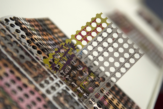
LESS IS MORE
Drilled Tabloid Magazine
8.5 x 11"
Edition of 1
Less is More comes from a body of work entitled PAPER OR PLASTIC, which consists of altered and recontextualized magazines designed to investigate the intersection of pop culture and Culture with a capital C. The work is a tabloid magazine which has been drilled out in order to systematically remove enough information that the reader/viewer must now work harder to recognize the subjects of the hollywood gossip factory.
Peter Bugg was born and raised in Madison, WI, where he ran track and cross-country and was an active member of the Boy Scouts of America. As an undergraduate at the University of Chicago, he continued to run competitively and studied photography under Laura Letinsky while he earned a bachelor's degree in economics. After graduating, Bugg took some time off from school and eventually decided to pursue an MFA. He was accepted in to Arizona State University's photography program in 2006. After arriving in the Valley of the Sun, Bugg acknowledged his fascination with celebrities, tabloid magazines and paparazzi and began making art about America's obsession with celebrity gossip, and recently, he interned at a paparazzi photo agency in Los Angeles, CA, where he gained an inside perspective on the industry. He received his MFA in 2010.
|
| |
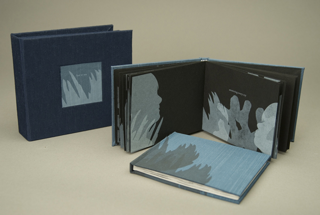
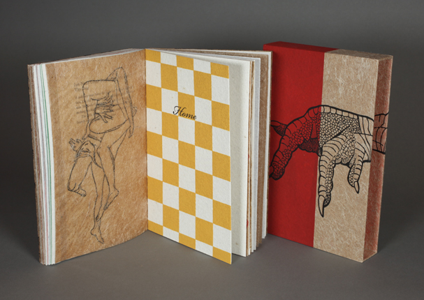
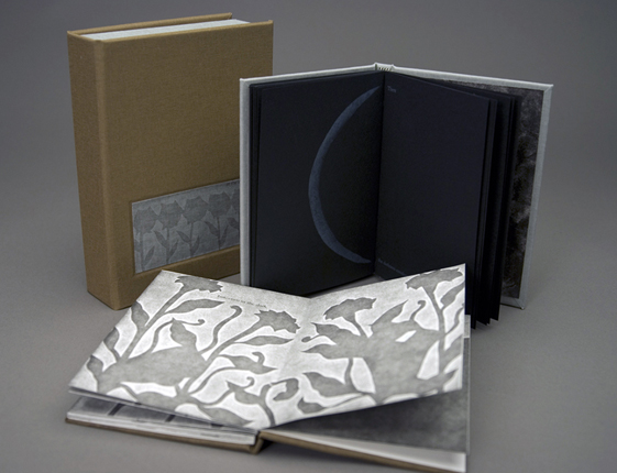
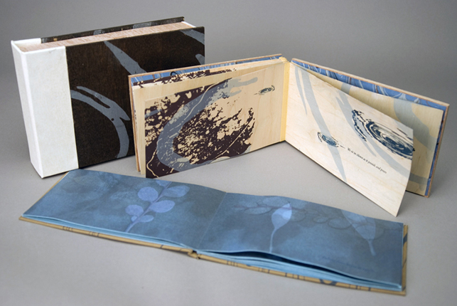
LOST AT SEA
Letterpress and screen-printed books in a clamshell box
5.5 x 4 x 2"
Edition of 3 |
| |
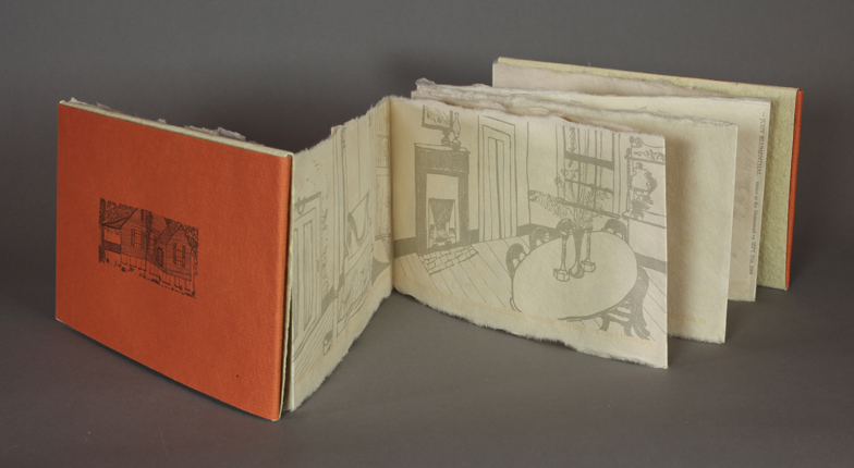
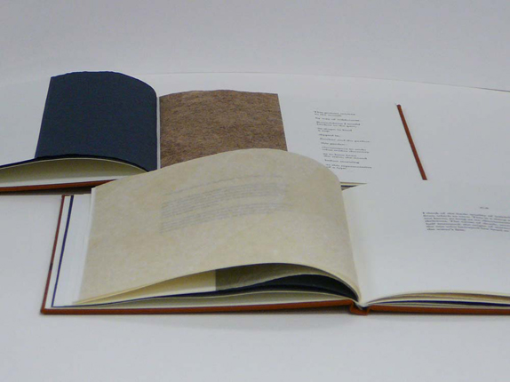
HISTORIC HAILE PLANTATION
Letterpress printed handmade book. Printed from handset metal types, photopolymer plates, and pressure printing. Kitakata and Indian Khadi Handmade paper.
4 x 8"
Edition of 25
The Haile Plantation Subdivision now sits upon what used to be a real plantation, called Kanapaha. The Homestead is all that remains, and can be visited. Many people do not know that this place is here. Historic Haile Plantation is a combination of collected ethnographic research, field notes, and first hand accounts from visitors and descendants of the Hailes and the enslaved laborers, as well as my personal reflections concerning the Historic Haile Homestead in Gainesville, Florida. This book is letterpress printed using Caslon handset metal type, and Bembo type printed from photopolymer plates. The imagery is a combination of handmade collagraphs and line drawings printed from photopolymer plates. Japanese Kitakata paper is used for the folios, and Indian Bagasse handmade paper is used for the covers and spine of the book.
Abby Chryst is an architect and a designer, who graduated from Temple University in Philadelphia, PA in 2007 with a Bachelor of Architecture degree, and is a recent graduate of the University of Florida, receiving a Master of Fine Arts degree in Graphic Design. Focusing on design for social change and sustainability of culture as well as materiality, her designs strive to connect cultures and invoke personal reactions to the history and meaning of place as well as investigating social as well as collective memories and the ideation of a regenerative design.
www.abbymariechryst.com
|
| |
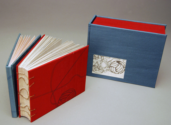
PULL IT HARDER
Clamshell: Marine Blue cloth exterior. Insets are printed via Epson laser on Somerset book white paper The interior of the clamshell is Deep Red silk moiré cloth and is lined in fawn Canson textured paper.
Book of Knots: Casebound accordion folded book in Marine Blue cloth with a letterpress cover Interior is printed via Epson laser with letterpress text on Somerset Satin paper.
Book of String: Bound by patterned link stitch and covered in Deep Red silk moiré cloth. Cover contains letterpress illustration by hand cut stencil. Interior leaves are printed via Epson laser with letterpress text and letterpress blind debossed illustrations on Bristol paper.
6.5 x 5.5 x 2.5"
Edition of 3
Pull It Harder strives to correlate the relation of string theory to the physical and spiritual self. It is composed of two handmade books and a clamshell case. The first book is hardbound and accordion folded to allow each spread to relate to the next. This fold also allows the book to be pulled out into a complete circle, which is the universal symbol of life and togetherness. The Book of Knots depicts knots of varying complexity from the loop to the monkey's fist. These knots of string are compared through poetry to the discontent between the physical self and the spiritual self.
Brenna Rae Dunlavy grew up in Rogers, Arkansas near the Ozark Mountains. Much of her childhood was spent exploring these mountains with the aid of dogs. She attended school in nearby Bentonville, Arkansas. Her work is aimed at exploring the world around her and telling stories layered with philosophical and scientific theory.
|
| |
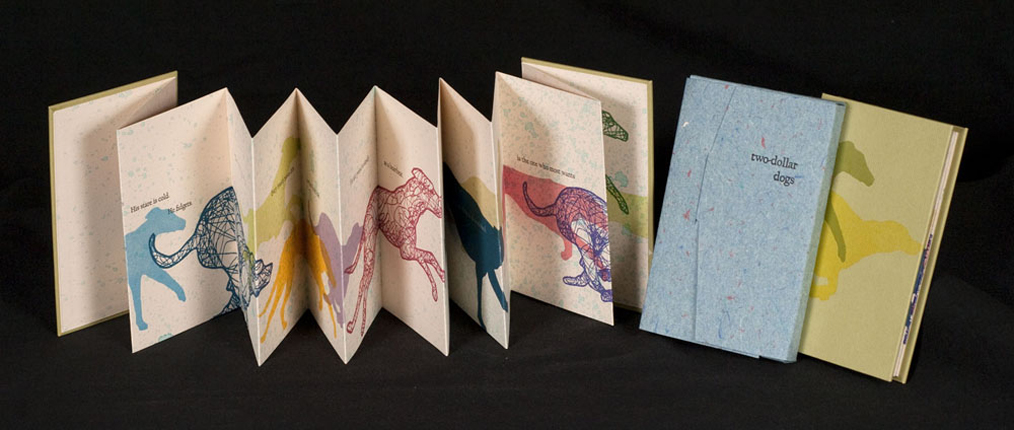
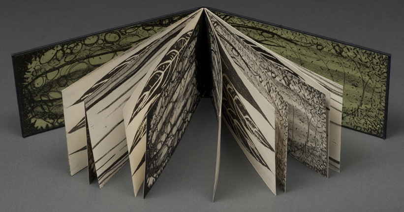
TWO-DOLLAR DOGS
Letterpress printed with photo-polymer plates. Accordion structure with 14 panels, hardcover. Housed in a protective wrapper made of 100% cotton handmade cover stock.
3 x 5" closed, 42 x 5" open
Edition of 40
Two-dollar Dogs:
With a narrative that alludes to a night at the dog track, Two-dollar Dogs is a blend of subtle text and dynamic images that explores the greyhound as a metaphor for love. Text and illustrations by Lauren Faulkenberry of Firebrand Press.
Lauren Faulkenberry produces books under the imprint Firebrand Press: "I am a collector of words and objects, images and desires. Books are my way of preserving memory and felt truths. Firebrand Press produces books, prints, and ephemera that are letterpress-printed and hand-bound. The content is at times driven by images, at times by text, and invites readers to examine the experiences that have made them who they are and consider those things in their memory that they most want to preserve."
|
| |
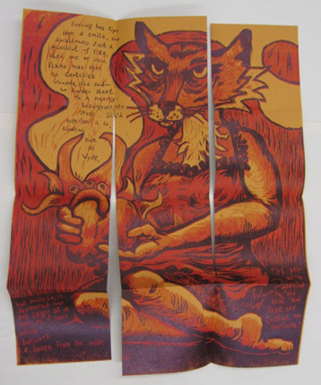
VIXEN
Letterpress printed with a woodcut and photopolymer plates. Text and illustrations by Lauren Faulkenberry. Hardcover. Fold-out structure.
6 x 6" closed, 18 x 24" open
Edition of 70
Vixen:
First in a series of three, Vixen explores themes of heartache and longing and describes how it feels to be set aflame by another.
|
| |
|
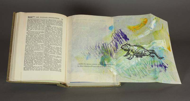
AN EXCAVATION OF MEMORY
Altered book with letterpress printed inserts. Images are woodcuts, photopolymer plates, and monoprints, produced on handmade papers and found pages. Illustrations and additional text by Lauren Faulkenberry.
5 x 7"
Edition of 1
An Excavation of Memory:
First in a series of five, this volume explores the nature of longing and obsession. It examines the patterns that emerge in our waking life, and the buried memories that are tied together by these patterns.
|
| |
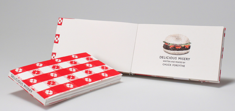
DELICIOUS MISERY
4 x 7"
Edition of 15
In Delicious Misery, Forsythe appropriates the visual and rhetorical style of a children's book with an unlikely theme of food safety. The result is rich with dark humor and whimsical public safety - a study in both satire and sincerity. This rich union shows how non-traditional narrative formats can be used to enliven a mundane or difficult subject matter to more effectively communicate an intended message.
Christopher (Chuck) Forsythe is an artist with an abiding interest in the book arts, letterpress, and printmaking. Since earning a B.A in Studio Art from Colorado College, Forsythe has immersed himself in the field of printing and book arts. In the fall of 2009, Forsythe began pursuing an MFA in printmaking with a certificate in book arts at the University of Iowa. Forsythe's imprint, Flagella Press, seeks to present an alternative narrative aimed at educating the public about the pathogens we encounter on a daily basis, while presenting facts in an entertaining and memorable way.
|
| |
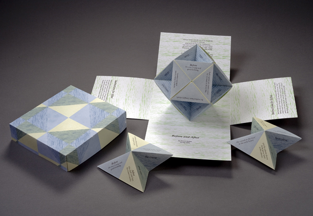
BEFORE AND AFTER
Offset printed in an edition of 100 copies at the Borowsky Center for Publication Arts at the University of the Arts in Philadelphia. Five color runs on the press and two different types of paper resulted in three different printed sheets: poster, box, and lid. The poster is intended to be cut down, yielding twelve 5" squares which are then folded into origami waterbomb bases and assembled into what is known as a "butterfly ball." The structure is then housed in the printed box with four sides that fold down when the lid is removed.
7.5 x 6.75 x 6"
Edition of 100
Donna Globus is a Philadelphia book artist and printmaker. After working as an architect and construction professional for almost twenty years, Donna went back to graduate school once again, and received an MFA in Book Arts/Printmaking from the University of the Arts in 2010. Donna was recently awarded a Grabhorn Fellowship by the College Book Art Association for study at the Arion Press and M&H Type in San Francisco. Donna is a Board member of Philadelphia Center for the Book.
|
| |
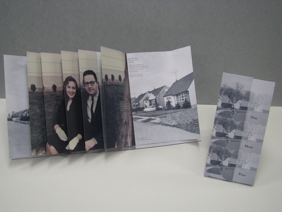
ONE MORE PASS
Offset printed in the Borowsky Center for Publication Arts at the University of the Arts, Philadelphia. The entire book and spine case are printed on both sides of a single 19" x 25" sheet.
19 x 25"
Edition of 100
One More Pass tells the story of a chance occurrence in a place planned to the smallest detail. The setting is Levittown, PA, in 1959: the houses are brand new, the streets endlessly curving, and the manicured lawns are all trimmed to the same height. Amid factual descriptions of the neighborhood, street names, and house styles, the story unfolds of a man and woman who are invited by a mutual friend to meet each other. The two stories are placed side by side in a structure that can either be read as a codex or extended as a concertina to view the corresponding images in their entirety. The woven structure allows the image of the planned community to deconstruct, even as the image of the couple builds.
|
| |
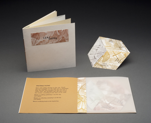
LEAFUTILITY
Letterpress printed entirely from metal type (even the angled text), with a background pressure printed from actual leaves. Books are printed four to a sheet, with the type rotated in the press bed to accommodate the angled text, then cut into strips and folded into tri-hexaflexagons. Each flexagon is housed in a translucent pocket sewn inside a letterpress printed pamphlet-stitched book containing title page, instructions for operating the flexagon, and colophon.
6 x 6"
Edition of 52
LeaFutility is a flexagon structure that shows the endless futility of watching leaves fall in autumn, raking them up and bagging them, only to watch more leaves fall. In order to read each of the flexagon's three faces with the text parallel to the edge of the book, some text must be printed at a sixty degree angle.
Inherent to the butterfly ball form is its bursting apart. Before and After tells two different parts of a narrative, before and after it is whacked apart. The story unfolds of an unexpected and life-changing event; depending on whether the pieces are assembled in a clockwise or counter-clockwise direction, the text describes the circumstances leading up to this event, and the rebuilding that comes after it. "Before," its pieces are carefully woven together in an intricate pattern. Then the ball is tossed in the air and struck, and the pieces float to the ground. After the WHACK, the pieces can either be left in disarray, or, like life, rebuilt into something new; the same pieces are re-assembled in the opposite direction to build the "after" story.
|
| |
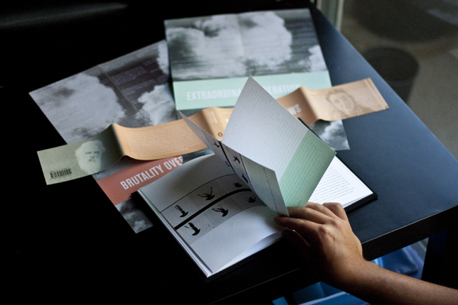
COSTUMES OF THE GIANT GROUND SLOTH: A FIELD GUIDE
This chronology of first sightings was printed with hand-set Bembo types and polymer plates on Stonehenge warm white paper, at the Center for the Book in Iowa City by Greene Ink Press.
14 x 14"
Edition of 62
When asked in 1999 if they could do something to "make the place less stuffy," the staff at the University of Iowa Museum of Natural History tied an extra long necktie around the 60-inch neck of their model Megalonyx jeffersoni. That tie was the inaugural act of what has become a tradition. Costumes of the Giant Ground Sloth: A Field Guide records the 24 known costumes displayed at UIMNH during its first decade of sloth dressing. The 2009 Costumes of the Giant Ground Sloth: A Field Guide honors both the sesquicentennial of the University of Iowa Museum of Natural History and its first decade of sloth dressing.
Kendra Greene is a Jacob K. Javits fellow at the University of Iowa's Nonfiction Writing Program and the Center for the Book. Her writing appears in Bonefolder and The Best Women's Travel Writing 2010, while her bookwork can be found in the School of the Art Institute of Chicago's Joan Flasch Artists' Book Collection. She began sloth dressing in 2008, with the Little Red Riding Hood costume.
|
| |
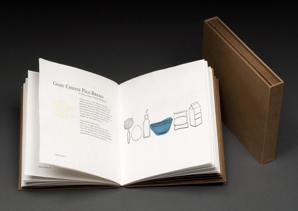
ALABAMA KITCHEN
All papers used are handmade of cotton and abaca--and hand-dyed using black walnut hulls. The binding is flatback, with a French-Web stitch used on the covered spine.
7.75 x 6.75"
Edition of 50
Alabama Kitchen:
This cookbook explores the uniqueness and growing presence of small farms in Alabama. Three Alabama farms contributed a total of 24 homegrown recipes to this culinary text. My goal when making this text was to produce a finely crafted book using precious materials that could also be used as a practical tool in the kitchen, without worry of dirtying the pages. It is precisely the visible use of this book that will bring this book into its ideal state. Several blank 'notes' pages are included in the back of this book for taking notes or recording personal family recipes.
Annie Herlocker graduated from the University of Alabama with a Master's in Library and Information Studies and an MFA in Book Arts. She is learning how to make some of her own bookmaking tools, acquiring her first printing press, and starting a book arts club in Nashville, TN. "My initial discovery of woodcut printing eventually led to my interest in bookmaking. It was after I made a second print from a single woodcut that I realized printing multiples did not equate to printing duplicates. In other words, each print is different though it originates from a single source. It is the ritual of making editions of a piece of work that is central to my relationship with printmaking and letterpress printing."
|
| |
|
ALLOWED TO BE
The text paper is all handmade from cotton and abaca and the endsheets are Fabriano. The binding is a flatback case binding structure and is composed of museum board and bookcloth. 2008.
5.5 x 5"
Edition of 35
Allowed to Be
This hand-bound edition explores the fleeting and simultaneously irreparable feeling of grief due to the loss of someone close.
|
| |
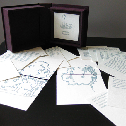
UNTITLED
The text on the cards features a Garamond typeface, as well as handwritten phrases. The title image, which is also included in the colophon, was hand-drawn and can be created in larger scale when the cards are turned over and put together. Both the text and the image were printed using polymer plates on a Vandercook press.
3.75 x 3.5"
Edition of 20
Paola's untitled letterpress-printed book has informally been named by readers as "the dream book." It tells the record of a vivid dream the artist had, and consists of sixteen cards housed in a hand-made clamshell box. The story unfolds as it would if someone were nostalgically describing the previous night's dream to a friend. With each card, the reader is provided with a new piece of the puzzle that is attempting to remember subconscious memories.
San Francisco-based artist, Paola Horevicz, was born in Curitiba, Parana in the south of Brazil. After age seven, she and her family moved to the United States, where they have lived in several parts of California. After high school, Paola moved back to the Bay Area and is now pursuing a Bachelor's Degree in Fine Art from the Academy of Art University in San Francisco. With a concentration in Printmaking, she specializes in letterpress, woodcut, silkscreen and book arts. Her work combines fine printmaking techniques with skills in bookbinding and boxmaking to create hand-made artist books.
|
| |
|
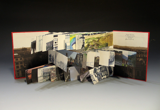
FEBRUARY 26-MARCH 7, 2009
Flagbook with scanned sketchbook images and photographs.
7 x 5"
Edition of 2
February 26–March 7, 2009 documents the artist's trip to Italy in the spring of 2009. The flagbook structure conveys the overwhelming, whirlwind sensation she experiences whenever she fondly reminisces about her time there. The text and drawings were scanned from the artist's sketchbook she filled during the trip, and the artist took the photos as well. The book can be viewed chronologically, or the viewer may flip through the pages randomly, further experiencing the memories as the artist remembers them.
Sara M. Lenton will graduate from Moore College of Art and Design in 2011 with a degree in Illustration and a minor in Graphic Design. Upon graduation she hopes to work with books in one form or another, whether it be illustrating children's books, designing book covers, or making her own artists' books. Currently she is completing an internship with Penguin Books in their Young Readers' Department. The book format suits Sara perfectly because it allows her to combine her passions for and strengths in narrative, illustration and design.
|
| |
|
•• ARTBOUND FIRST PLACE WINNER ••
COMPENDIUM OF DOMESTIC INCIDENTS
Text by Joanna Ruocco, images by the Kidney Press. Printed on handmade paper, of cotton rag and Alabama banana. Letterpress printed and silkscreened. An exposed spine binding, sewn on tapes, housed in a slipcase.
7.25 x 4.5"
Edition of 35
Compendium of Domestic Incidents
The quotidian, the erotic, the sometimes violent interactions occuring during the course of everyday activities within domestic spaces.
Sarah McDermott makes books and prints as The Kidney Press. Sarah graduated in May 2010 from the University of Alabama M.F.A. in the Book Arts program. She is interested in collaboration, especially between experimental writing and the book arts. "My work centers on issues of power, exploring relations/dominations between people, between people and animals, between people and their environments. Visually, I often use decoration to represent the human reliance on material culture to assert or define space; this is reflected in my emphasis on pattern, and in an orientation toward the ornate. I make drawings and prints both in and out of books. I start with the raw materials: fiber becomes paper, receives print, becomes book."
|
| |
|
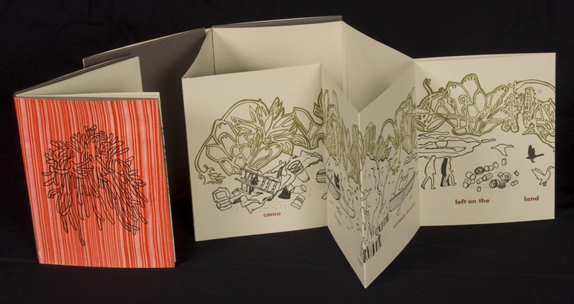
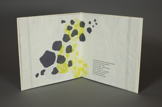
COMA
Printed with silkscreen, polymer plates/intaglio and metal type on a Vandercook No.3. The text comes from The Life and Times of Michael K by J.M. Coetzee.
6.25 x 5"
Edition of 30
Coma
A print meditation on an imagined post-apocalyptic migration.
|
| |
| 
DODGE COUNTY SUMMER
Printed with silkscreen, polymer plates/intaglio and metal type on a Vandercook No.3. The text comes from The Life and Times of Michael K by J.M. Coetzee.
5.25 x 5.25"
Edition of 30
Dodge Country Summer
This book uses text and image to explore family history through place: people and objects interacting with the Wisconsin landscape. The paper was handmade of cotton rag, hemp, abaca, and mystery pulp balls. Photopolymer and linoleum type and images.
|
| |
| 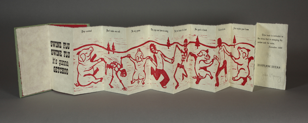
SWINE FLU
6 x 3.5"
Edition of 10
Swine Flu is directly inspired by the "Death Dance" prints of the Middle Ages. It is a scenario
influenced by the Bubonic Plague. Often depicted with skeletons dancing hand-in-hand,
this image is stricken with a depressing, light-hearted attitude. This idea was born within'
the hype of the Swine Flu "Pandemic". This old idea was then placed into the context of
today.
Joshua McGarvey a printmaking major at Ball State University.
|
| |
IN THE DARK
6 x 9"
Edition of 5
In the Dark deals with light and dark elements conceptually and physically. The first book in the set displays the progression of personal stress. Page-by-page, the moonflower plant engulfs every space in picture plane, allowing no room or air to breathe. The last spread uncovers the flower flourishing in the moonlight. The second book reveals an optimistic perspective, a search for a release with the guidance of the moon.
Elaine Miller is a 2012 candidate for the Bachelor of Fine Arts degree at the Memphis College of Art. "My concentration has been in the area of photography; however, I have also developed a strong passion for letterpress printing. Arranging my work in a book format helps me develop a strong sense of sequence both with my photography and conceptual storytelling."
|
| |
GROWTH
Lithography, double pamphlet book. 2009/2010
3.75 x 7.5"
In edition of 2, with one artist proof and three edition variations.
Growth is part of a larger body of work focusing on various aspects of ecology, ethno-botany (the relationship between man and plants), and sustainable design. The imagery in this book is based on plant forms and their structure at the cellular level. The images are both real and suggested.
Sara Parkel of Filter Press is a bookbinder, printmaker, and book artist currently working towards an MFA degree in Book Arts from the University of Alabama in Tuscaloosa. She is the proprietor of Filter Press and an active member of Booklyn (www.booklyn.org) and The Center for Book Arts in NY. She has worked professionally as a letterpress printer and bookbinder, has taught classes in bookbinding/book arts and letterpress, and has been a visiting artist at the elementary through college level. Her artist books are included in several public and private collections from the Boston Public Library to the Museum of Contemporary Art in Chicago.
|
| |
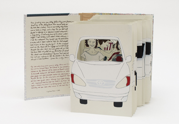
ROAD TRIPS
Screen-printed and hand-bound tunnel book with a hinged trunk on the back cover.
9 x 6.5"
Edition of 2
Road Trips is part of a larger series that explores stories told and memories shared in my family. This book explores road trips my mom and I each took during our undergraduate years. In both cases, a particular artifact from the drive remained in the trunk of the car. The texts of the two depicted stories are found on the inside of the front cover.
Ashley L. Schick is beginning her second year as an MFA candidate in the Printmaking Department at the Atlanta campus of the Savannah College of Art and Design. She received her undergraduate degree in Printmaking, with a minor in Packaging Science, from the University of Florida. She has completed study abroad programs at the UF Paris Research Center in France, at the Skopelos Foundation for the Arts in Greece, and at the SCAD-Lacoste campus in the south of France.
|
| |
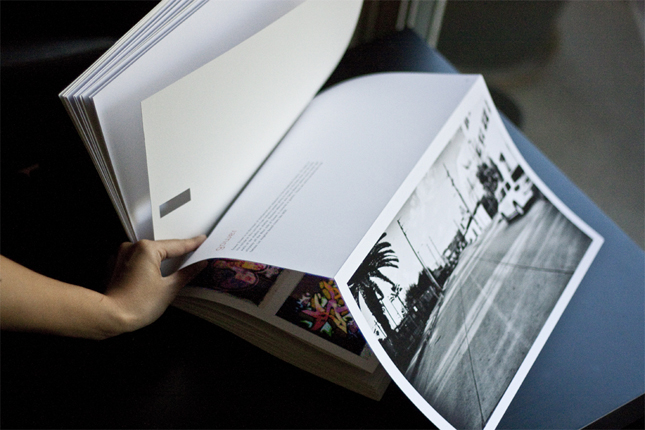
LOS ANGELES GRAFFITI
9.5 x 13"
Edition of 1
Los Angeles Graffiti was produced for "Shooting the Land: The Contemporary Landscape" at UCLA in 2010 under the direction of Professor Rebeca Mendez. From the banal snapshot of one's backyard to classical photography of the sublime and human awe of nature, we explored the full range of artistic photographic practice in the broad context of nature and the landscape. My project focuses on Los Angeles as a fluctuating urban canvas. I shot photographs at myriad locations around the city starting with famous graffiti yards. This book is a culmination of my research, exploration, and photography.
Zak Scott was born, raised, and cultured in Oakland, CA. then educated in Los Angeles, CA. "I'm passionate about my family and friends, good design, and Dr. Pepper. When I am not hustling for the next paycheck you can find me climbing mountains on a road bike, racing omniums on a track bike, or cruising on a skateboard."
|
| |
RIVER OF SHADOWS
5.75 x 7.75"
Edition of 1
River of Shadows was produced for "Visual Communications II" at UCLA in 2009 under the direction of Professor Rebeca Mendez and Bob Stein. The course focused on research, strategies, and processes for the concept and design of River of Shadows by Rebecca Solnit. The book is a cultural history of technological change in the second half of the nineteenth century as told through the life of Eadweard Muybridge. Bob Stein, the founder of The Criterion Collection and Voyager and currently the director of The Institute for the Future of the Book, purchased the rights to publish both a large format print edition using the highest quality digital scans of the Muybridge images and an electronic edition expanding on the original text in three ways: extensive linking from the text to the Internet, access to motion imagery where appropriate, and a powerful social component enabling readers to communicate with each other in the margins. This is the manifestation of my concept and design proposal for the print edition.
|
| |
•• ARTBOUND SECOND PLACE WINNER ••
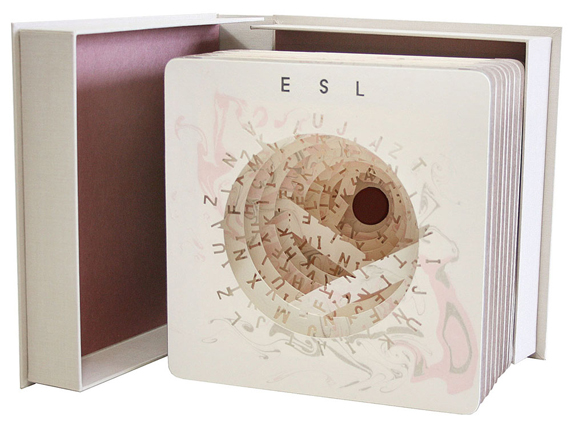
ESL
This book is bound in tunnel book style binding. It consists of 10 sheets of hand-marbled Arches heavy-weight paper with punched alphabet. The book is contained in a handmade drop spine box with hot stamped title in the spine.
10 x 10 x 2"
Edition of 5
ESL
When one does not understand a language; the language becomes a wonderful design. English is text but to me it is also beautiful forms of shapes and patterns.
"A big challenge in my life is mastering the language of English. For me the process is like solving different puzzles. Whenever I develop my English and feel that I have improved, there are always other aspects of the language that I need to work on. Ultimately though, from constant efforts I believe I can accomplish my goal to feel English like my first language. After all, there is always light at the end of the tunnel."
Jana Sim is a book artist born and raised in Korea, and came to the U.S. in 2002. While Sim studied art at University of Illinois at Urbana-Champaign, she became fascinated by the book arts, and dedicated her artistic practice to learn about making books. Sim earned her BFA in painting from UIUC and currently she is in the MFA book & paper program at Columbia College, Chicago. Her book art works are at numerous exhibitions internationally and her works have been collected at universities, museums and private collectors. "My works are Autobiographical art. The early works express my yearnings for my family and home country. But the theme of my art changed as the time I spent in the United States became longer. I became more accustomed to living in the U.S. and I spent less time missing Korea and my art became more centered on myself and my life. The recent works are based on my struggles and triumphs living with two languages (Korean and English) and cultural differences between Korea and the United States."
|
| |
•• ARTBOUND THIRD PLACE WINNER ••
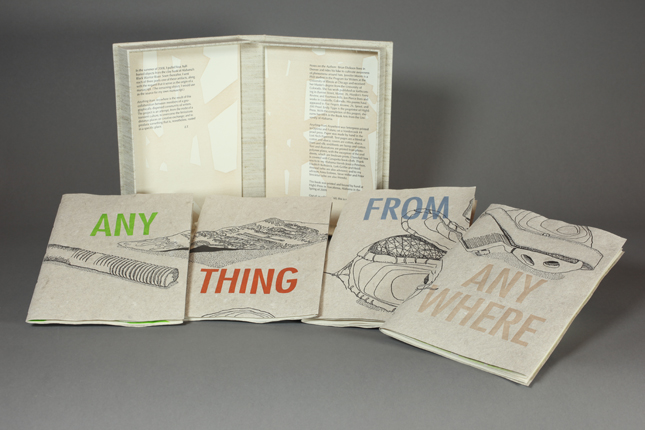
ANYTHING FROM ANYWHERE
Poems by Brian Dickson, Jon Pierce, Jennifer Moore and Emily Tipps. 2009. Letterpress printed in Optima and Futura from photopolymer plates on a Vandercook #4.
5 x 7.5"
Edition of 60
Anything from Anywhere:
Anything from Anywhere is composed of four poets' responses to objects unearthed from the banks of Alabama's Black Warrior River. The collection concerns the evocative power of place and imagined, interlinking narratives of found objects. Four pamphlets, housed in a clamshell box, can be removed and arranged like puzzle pieces to reveal a single still-life image.
Emily Tipps is a writer, teacher and the founder of High5 Press. She received her BA in English from Wesleyan University, CT (2000); her MA in Creative Writing from the University of Colorado, Boulder (2006); and her MFA in Book Arts from the University of Alabama, Tuscaloosa (2009). Her work has been exhibited nationally, and is accessible through numerous libraries' special collections, and at high5press.com. "I aim to provoke energetic reader interaction with innovative texts, using letterpress printing, hand papermaking and hand bookbinding to create limited-editions whose content and form are conceptually and interestingly related."
|
| |
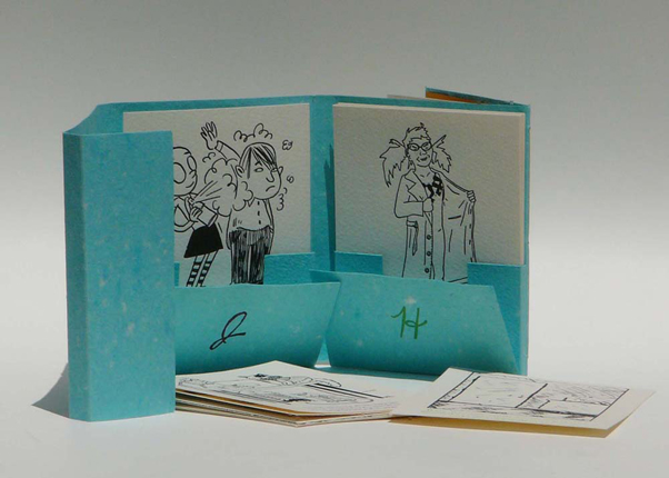
HEIDI AND JANE: A CURIOUS CASE
Text by Emily Tipps. Illustrations by Melanie Lewis, Damien Jay, Adam Weinstein and Emily Tipps. 2008. Paper: cotton/linen handmade by the artist, Biblio & Arches. Letterpress printed on a Vandercook #4.
9 x 6.5"
Edition of 35
Heidi and Jane: A Curious Case:
Heidi and Jane re-imagines Robert Louis Stevenson's Dr. Jekyll and Mr. Hyde. Its premise is that human duality is not simply black-and-white. The book's design is whimsical, colorful and interactive; it opens to several pages of prose, and further unfolds to reveal two decks of comic cards—one chronicling Heidi's antics and one Jane's.
|
| |
THIRST OR SURFEIT
Poems by Elizabeth Robinson. 2007. Letterpress printed in Baskerville and Copperplate Gothic Light from photopolymer plates on a Vandercook #4.
7 x 7"
Edition of 50
Thirst or Surfeit:
In writing these poems, the poet says, she "was interested in reclamation of a lost history or geography and how a crumbling, degraded site can open up in surprising ways." The case-bound book features three different types paper made especially to complement the text: earthy banana palm, deep blue linen & translucent flax. Thus, in this book, color and texture replace traditional illustration.
|
| |
RIPPLED RESPONSES
Printed wood veneer
9 x 5.5 x 2"
Edition of 3
"Raised in Southern Louisiana, I have witnessed the extreme force of nature and I have continued to experience the aftermath it has left on my own physical and psychological landscape. I am interested in the effect both time and control have over my surroundings. In my current body of work, I explore the permanence and strength of natural forces and the resulting deterioration of manmade landscapes.
In this body of work I printed on thin wood veneer — a chilling reminder of devices used to board up windows in preparation of the approaching threat. This not only references my own attempt to protect my home during the threat of a hurricane, but also serves as a symbol of abandoned neighborhoods that are now boarded shut. Regardless of the strength of the structures, barriers and boundaries created to divert peril, we are still left vulnerable to the destruction and decay that will inevitably seep into our surroundings and alter our sense of security.
Mark Waguespack received his B.F.A. with a concentration in Printmaking from the Memphis College of Art in 2010. During this time he studied a variety of book arts techniques such as Bookmaking and Papermaking and focused on combining these approaches to art. Mark was born and raised in New Orleans, Louisiana. In his work he explores themes of the unpredictably of nature and its interaction with man made landscapes.
|
| |
GATHERING (ONE AT A TIME)
5.5 x 4"
Edition of 3
The two works I have entered both deal with the concept of displacement. Gathering (One at a Time) deals with my desire to create and build a home, a place of comfort. Here, I am represented as the sparrow, collecting pieces one bt one to build a nest, a home.
Jade West is a 2010 candidate for the degree of bachelor of fine arts at Memphis College of Art. "My concentration while at MCA has been in the areas of painting and book arts. I have found that the book format allows me to express my ideas and concepts in a more personal format, something that can be handled and experienced. The book binding process is one that I thoroughly enjoy."
|
| |
WADING
4-4.5 x 3"
Edition of 3
In Wading, I explore displacement through the idea of surface in which I express my fears through imagery of being under water and multiplying ripples. The water is a metaphor for surface, for an experience in my life from which I cannot escape.
|
|